Work

Thursday, 15. May 2008

Progress

...on the Letter front. Well, sort of. Still not 100% sure about the final 'system' but that's why I'm carrying out these experiments. At least the overall direction / look is becoming somewhat clearer. The thing is, that I know that I'm not even nearly gonna be able to finish this thing – so why not put more effort into good rough sketches instead of detail fidgeting?

Wednesday, 30. April 2008

Book Wrap Quickies

Our current assignment in Typography class is to pick one book each week, do a thorough analysis of it's content / design and create a wrapping for it reflecting the results of our analysis. Each week the book we're supposed to pick has to be a little different, so far: 1st week – one of our favorite books (Graphic Agitation 2), 2nd week – a newly bought second hand book (1970s Italian train schedules).

bookc1 bookc2 bookc3 bookc4 bookc5 bookc6

Thursday, 3. April 2008

Spilt Milk

There they are – the final results of the big 'Demonstration Manual' project, which I presented last Friday. A short explanation what it was all about:

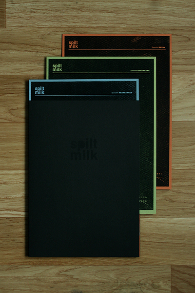
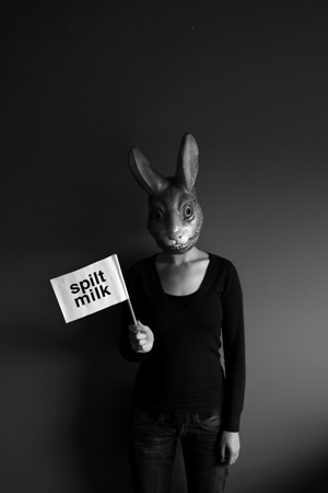
The brief was to pick something to demonstrate for or against and make a manual for a demonstration concerning that topic. That was supposed to include everything from name, logo, CI to flyers, posters, banners, info stands and even chants or choreographies, as well as instructions for the city of how to deal with the demonstration. In the process of the project, I decided to go a slightly different way. Instead of doing just one specific demonstration I chose to invent a fictional underground organization – called 'Spilt Milk' – that plans and organizes protests / demonstrations for whoever is in need of one.

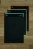
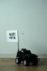
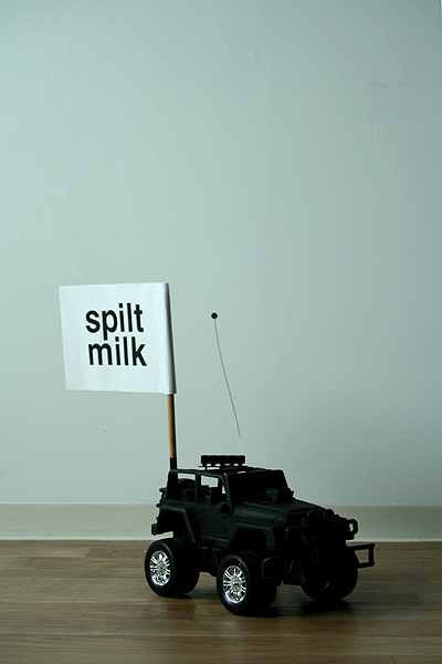
What I ended up with is shown below. Two folders with loose pages and a couple of gimmicks. One of the folders holds 12 color-coded manuals with instructions on how to conduct a specific demonstration. That included everything from the needed materials and where to obtain them, costs, number of persons needed, risks (what laws would be broken) and presumed effectiveness as well as preparation and execution instructions. The additional picture is just a small hint of how the whole thing could look. Most of these manuals are actually rather for performance art / flashmob inspired actions than real marches. The toy car for example is part of one of these concepts: instead of walking through a street with posters, mount little flags to remote controlled cars and steer a whole horde of them through the inner city (the people steering them would be located on the roofs of surrounding buildings). The manuals where first printed on regular paper and then copied onto thick textured colored paper.

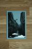
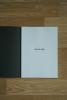
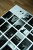
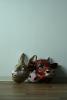
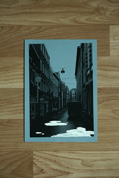
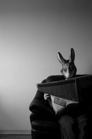
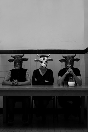
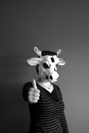
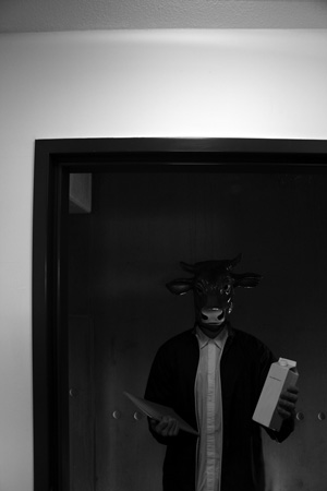
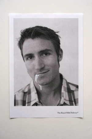
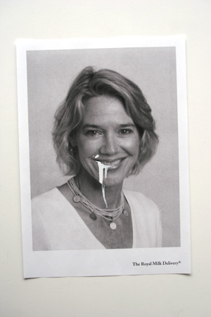
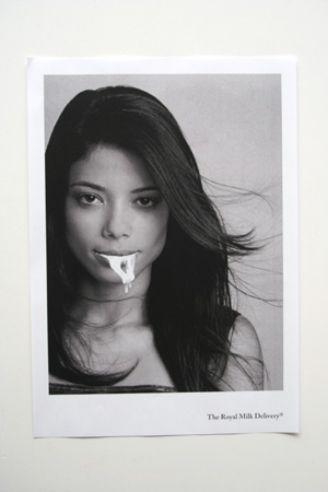
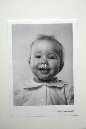
The second folder holds the manifest of the organization – who they are and what they stand for – as well as 22 full page photographs, explaining the process of how the organization works (how they advertise, how to get in contact with them, how they deal with assignments etc.). You can see six of these shots up close 
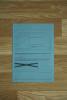
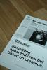
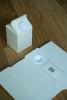
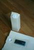
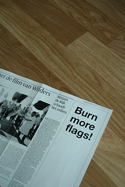
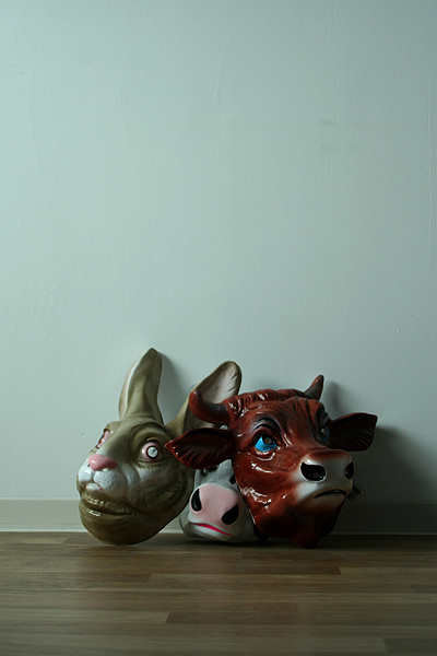
here. The rest of the pictures below show two of the organizations newspaper advertisements (under a fake name), the masks used for the photo story as well as two prepared milk cartons. The latter were supposed to be used for 'secret' communication between client and organization, delivering messages and final manuals hidden inside milk packages and brought to the doorstep via delivery service.

spilt1 spilt2 spilt3 spilt4 spilt5 spilt6 spilt7 spilt8 spilt9 spilt10 spilt11 spilt12

Sunday, 30. March 2008

Cows & Bunnies

Here are six out of 22 pics of the photo shoot with the Erlangen connection. The photos are part of the big project and were used to explain how my fictional organization functioned. I think it'll all become clearer once I upload some images of the work, hopefully sometime next week.

cows1 cows2 cows3 cows4 cows5 cows6

Wednesday, 5. March 2008

Paintmarker Fun

Eat, drink, sleep, work, organize, watch 'Scrubs'. That's pretty much sums up my daily rhythm right now – therefore not much movement on the blog. Here's some work-in-progress stuff, idea's already been kicked again, but hey, I still like them :)

milk1 milk2 milk3 milk4 milk5 milk6

Monday, 18. February 2008

Friday Night Boredom

That's what happens man! That's what happens...

friday1

Saturday, 19. January 2008

Happy Days

Finally! The results of my illustration project. I was almost going mad on these things the past week. Wanted to finish them quickly but in the end I stayed at school til 12 five nights in a row – sketching, pencil tracing on the light table, adding watercolor and retracing again with markers. The subject was 'Newspaper Illustration' – I chose my headlines from controversial topics: school massacres in the US, child suicide bombers, child abuse by catholic priests, war veteran suicides and rising fascism in East Germany. The drawings are on 50x70cm canvases each. The titles of the articles can be seen on top of your browser when clicking the pics.

if_only_all_students_had_weapons my_dream_was_to_be_a_suicide_bomber new_priests_old_problems the_veteran_suicide_epidemic we_don-t_have_space-for_foreigners

Monday, 17. December 2007

Choppy Chop

As promised some shots of the work in progress as well as results from the other groups. The last one was done with photocopies and paint thinner – hence the grungy look.

kontra1 kontra2 kontra3 kontra4 kontra5 kontra6

Sunday, 16. December 2007

Chop Chop

And here it is. Linn did the capitals, while I stuck to the lower case letters. The right pic is the poster we had to print in 70x100cm and the left one is Christmas card we had to design with 'our' font.

Sunday, 9. December 2007

Typography Workshop

Last Wednesday we started a typography workshop with Elias Werner, a young guy working as a type designer for Kontrapunkt. Actually Bo Linnemann was supposed to do it but for some reason dropped out. First task: blindly pick a font from a stack of paper, find out which one it is, write a quick summary on it and design a black&white poster in 70x100cm using all the letters of that font. Time: 3 days. Here my experiments with 'Wittenberg Fraktur Bold' (coincidence I swear), the broken 'h' is the one that I printed in the end.
By the way, this is also marky my 100th-Blog-Entry-Anniversary! Yeaay!

frak3


Life Abroad (CPH)
Life Abroad (DH)
Life Abroad (OSL)
Life At Home (DAR)
Life At Home (ERL)
Pardy Hardy
Props
Random Things
Stuff
Videos
Work
Profil
Logout
Subscribe Weblog