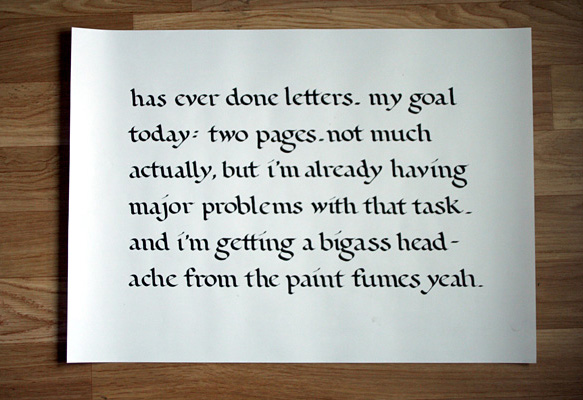
...with both the font and calligraphy. Unfortunately last week we had our last meeting with the ingenious Frank Blokland. As none of the exchangies was prepared for this – we all thought we still had at least a week – we could only show him our crappy sketches instead of (attempts on) precisely drawn pages. Nonetheless, Cécile and I ended up having a nice chat with him about Microsoft vs. Mac, red wine and his new house. In addition to that he let us in on a little secret and showed us the first stages of a very very cool project he's currently working on that in my opinion will revolutionize the process of creating fonts. Sorry, can't tell you much more at the moment, but keep checking his website
Dutch Type Library – this fall you should be able to see what I mean. But that 'thing' showed that this guy is truly a master of his craft – not only has he perfected the use of the broad nip pen and brush, but he's also willing to adjust to changing times... Gotta love that geeky guy.
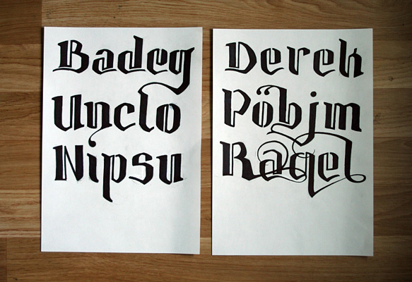
As for my font, you can see how it's going. I tend to drift off easily and add useless swashes to my letters instead of concentrating on their 'pure' form, making them look a lot like Latin thug tattoos. But I think, this might actually be a good use for the final version – should there ever be one, which I doubt. At least it could be a nice way of presenting the current state of my Bastei font in two weeks time.
